This project started with the goal of understanding what options are available for water utilities in cities with shrinking populations to finance their infrastructure. Since most utilities rely on their customers for revenue, we wanted to understand the financial burden that is already present for those customers. While we could find a few reports about affordability, we could not find the actual data to do our own analysis. The limiting data were the rates that utilities were charging their customers. While rates information may be on utility websites, there was not a centralized, publicly available database.
Then the pandemic started. It turns out that some of our team members find a great deal of comfort in repetitive data entry… something that was much needed in those early pandemic months. We are building a database of water service rates (drinking water, wastewater, and stormwater) for single family residential households. As of June 2021, 1,800 utilities are represented across five states (California, North Carolina, Oregon, Pennsylvania, and Texas).
We designed a process that would enable the automated calculation of five affordability metrics as long as we had (1) rates data and (2) service area boundaries. We designed a dashboard to allow users to explore the results for the different affordability metrics in their utility, as well as to compare those results with their peers. We also let users explore their rates and rate structures alongside their peers, and provide some basic demographic characteristics in the service area.
Lastly, affordability metrics depend on the household's water usage and that depends on many factors, including the number of people living in that household. This tool allows users to change the amount of water used and see how that affects rates and affordability. The tool also summarizes these metrics by the volume of water used so users can understand when water becomes less affordable given current rate structures. We used these data to explore very specific questions around affordability: how affordable are water services and how do affordability metrics compare with each other. We are making the data and code open source in the hopes that others will use the data to ask their own questions, explore solutions, and work towards improved water affordability and equity.
Our hope is:
that others will use the data in their own applications to ask questions, explore solutions, and work towards improved water affordability and equity.
Who we are
MARTIN DOYLE
PROGRAM DIRECTOR
martin.doyle@duke.edu
Learn more
LAUREN PATTERSON
SENIOR ANALYST
lauren.patterson@duke.edu
Learn More
Katy Hansen
SENIOR ADVISOR
katy@policyinnovation.org
Learn More
Erika Smull
PHD STUDENT
erika.smull@duke.edu
AISLINN MCLAUGHLIN
GRADUATE STUDENT
aislinn.mclaughlin@duke.edu
SOPHIA BRYSON
GRADUATE STUDENT / LIMNOTECH
sophia.bryson@duke.edu
AUSTIN GUIMOND
GRADUATE STUDENT
austin.guimond@duke.edu
LAURA (ADDIE) NAVARRO
GRADUATE STUDENT
laura.navarro@duke.edu
JACK CARPENTER
GRADUATE STUDENT
jack.carpenter@duke.edu
This research is generously supported by
What data did we use to make this dashboard?
We developed a process that allows users to explore multiple affordability metrics within and across utilities to improve transparency and further our understanding of water affordability.
We also included data from the Bureau of Labor Statistics at the county level regarding unemployment to see how unemployment levels have changed in the counties served by utilities.
To do this – we need 3 pieces of data:
More details about census data
Census Code
Geography Level
Data
How we used these data
B01001_001E
Block Group
Total Population
To show the utility population and identify the population per household to remove blocks with more than 10 persons per household (e.g universities, prisons, hospitals)
B19001_001E
Block Group
Total Households
Used to weight affordability metrics based on the percent area overlap between block group and the utility service area.
B19001 group
Block Group
Number of households in different income brackets
To estimate the income earned by the 20th percentile household (considered low-income), to show the distribution of households by income (IDWS),
and to calculate the percent of households spending more than some percent of their income on water services.
B19013_001E
Block Group
Median Household Income
To calculate the traditional affordability metric
B250334 group
Block Group
Number of households by decade built
To show the relative ages of houses (and pipes) compared to expected pipe life expectancy and when the Lead & Copper Rules took effect.
S0101_C01_001E
Tract
Number of households surveyed for poverty
To calculate poverty prevalence in the tract and utility
S1701_C01_042E
Tract
Number of households below 200% of the federal poverty level
To calculate poverty prevalence in the tract and utility
B06001 group
Tract
Population by Age
To show the percent of the population below 18, in working age, near retirement, and at retirement age.
B02001 group
Tract
Population by Race
To show the racial diversity of the population in the utility service area.
B03001 group
Tract
Population by Ethnicity
To show the ethnic diversity of the population in the utility service area.
(3) Service Area Data refer to the maximum extent of the geographical boundaries served by a utility. There are a handful of states that provide a statewide shapefile of drinking water service areas, but we are not aware of any publicly available statewide wastewater or stormwater boundaries.
For some utilities, the same boundary applied to drinking water, wastewater, and stormwater services. These boundaries let us connect the rates data with the census data to estimate affordability.
See a map of states with public service area boundaries

Data source for state boundaries
These data are combined together to estimate the affordability of water bills:

How do we estimate monthly water bills?
The first thing we need to know is how much households are spending on water services. But that amount depends a lot on the household! We will get into what is considered "enough" water for domestic purposes later, but in general a person in the US is likely to use between 50 to 100 gallons per day.
How much water do households use in a month?
The amount of water then depends a lot on how many people are living in your house and the number of days in the month to start with. Since we are looking at affordability, there is concern that people have "enough" water to live on (not so worried about swimming pools and green lawns). A one person household could use between 1,500 gallons to 3,000 gallons in a month while a four person household would use 6,000 to 12,000 gallons in a month. And this does not include considerations for the types of water fixtures, any medical needs requiring water, and so on.

We calculate an estimated bill for every thousand gallons of water used from 0 gallons to 16,000 gallons to let users select the amount they typically use in their household or in their community. We calculate the amount a household would pay each month given that volume of water using the rates in the rates database. All bills are calculated for a monthly amount (even though utilities may send bills every other month, quarterly, or annually). We calculate separate bills for drinking water, wastewater, and stormwater (if present). It is important to note that we did not account for one time costs (like connection fees) or customer assistance programs (limited data available) that may affect the bills of some customers. We provide more details about how we calculated bills in the following sections.
What if there are more than one wastewater or stormwater providers in my service area?
Currently, we only have the service area boundary for drinking water providers. We calculate the average bill when there are multiple wastewater or stormwater providers within the service area. This was especially common in Pennsylvania where drinking water and wastewater are often provided by different utilities. We provide a table with all wastewater and stormwater provider used to calculate the average bill for a selected utility in the How much do water services cost tab in the dashboard. For example, the North Penn Water Authority provided drinking water services to all or portions of 10 municipalities; yet each municipality had its own wastewater utility with rates ranging from as low as $15.93 per month in Lansdale to as much as $57.30 per month in Soulderton at 4,000 gallons per month. No wastewater rates were identified for two townships, although these townships may receive services from nearby townships. In these instances, given missing data and lack of spatial wastewater service areas, we calculated the mean wastewater bills within the drinking water utility service.

What if I have a drinking water provider but we only have septic systems in our community?
We substitute an estimated monthly amount that homeowners will spend to maintain a septic system based on average costs to maintain and replace septic systems. We recognize there is a tremendous range in septic system costs depending on the soil and drainage characteristics of the landscape and may not accurately reflect your conditions. We are open to suggestions for improving these estimates to tailor to state or other conditions:
- The median cost to replace septic tanks was estimated at $6,733 with a lifetime of 25 to 30 years.
- The median costs for routine plumbing were $391 every 3 to 5 years.
- The median cost to address problems requiring a plumber were $520 and occur once every 10 years.
This results in an estimated cost to homeowners of $32.89 per month.
We provide a table with all wastewater providers in the How much do water services cost tab in the dashboard to identify when we believed the community used septic/on-site lots.
What if my utility charges different rates based on where you live?
Utilities may charge different rates to different regions within their service area, often based on distribution type (pump or gravity), location (closer or farther away), elevation (more expensive to pump water higher), and so on. Here, we estimate the average bill because we have no way of knowing where these different rates are applied. There is one exception, and that is when there are “inside-outside” rates, which was very common in some states. Here, utilities charge different rates depending on if a customer was located inside or outside of a utility’s political jurisdiction or municipal boundary.
We estimated inside-outside rates in this project because: (1) inside-outside rates were common, (2) the rates were often quite different (outside rates were often 1.5 to 2 times higher than inside rates), and (3) we have current municipal boundaries. We assigned households to inside rates if they were located within the municipal boundary and outside rates if households were located outside of the municipal boundary (but inside the service area). For example, Greensboro, NC provides water to those living inside the Greensboro municipal limits as well as outlying areas.
Those living inside city limits were assigned inside rates (an estimated monthly bill of $46 at 4,000 gallons), while those living outside of the city were assigned outside rates (with an estimated monthly bill of $110 for 4,000).
The big assumption is that current municipal boundaries accurately reflect inside and outside charges. For utilities with inside and outside rates, and where there were known stormwater services, stormwater rates were only applied inside the municipal boundary because stormwater services are often provided by the public works department of municipalities.

How do we estimate household incomes?
The census data provide information about the population and households in nested geographic areas. Each state contains counties, each county contains census tracts that are designed to account for ~4,000 persons. A tract will split into two if the population grows to 8,000 persons. Within a census tract are block groups that contain between 250 to 550 housing units with new block groups forming as housing increases. The smallest census unit is the block. As we go to smaller and smaller units, the census provides less and less information to protect privacy. For our purposes, most of the data we needed were found at the block group and census tract scale.
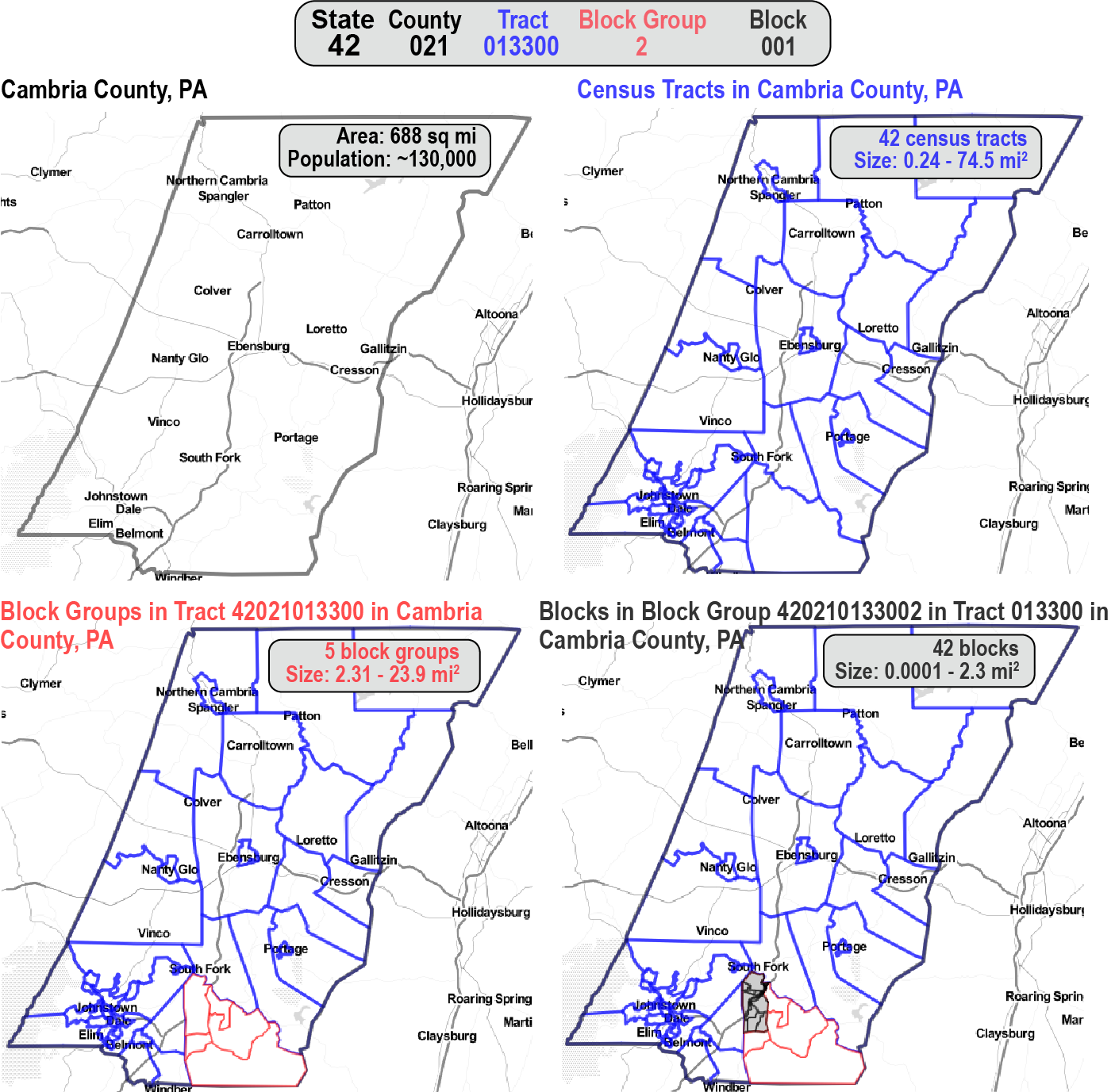

We overlay the census block groups and tracts with the service area boundaries to find out which block groups and tracts intersect each utility. Since the overlap is not identical, we calculate the percent of overlap and weight the number of households based on the overlap. For example if there were 100 households in the block group, but only 25% of the block group is in the service area, then we only include 25 households. We then add up all the households within the service area boundary based on income bracket. We generate a random income within that income bracket for each household. Then we take all the incomes in the utility and calculate the 20th percentile (considered low-income) and the 50th percentile (median income). We go into greater detail in the AFFORDABILITY METRICS tab.
How do we calculate affordability metrics?
Select the AFFORDABILITY METRICS tab above to find out!
What metrics did we use to explore affordability?
Understanding the affordability of water services is complicated and there are many ways of looking at this question. The most basic question is whether or not water services are affordable for an individual household. Unfortunately no single entity has these data. There are also questions about how much water needs to be affordable for any given household. We included one metric that looks at how affordable water service are for households with a single worker earning minimum wage.
- Minimum Wage Hours: are water services affordable for households earning minimum wage?
Minimum Wage Hours refers to the number of hours a household would need to work at minimum wage to pay for water services. A rule-of-thumb that has been offered is that the amount of water needed to meet the basic needs of a 4-person household should not exceed 8 hours of minimum labor. Interestingly, an 8 hour rule of thumb each month is 4.6% of their monthly earnings (assuming 40 hour work weeks) and in line with the Traditional Metric recommendation (see key takeaways). The federal minimum wage in 2021 is $7.25 (set in 2009). States may adopt the federal minimum wage or set higher wages. Within a state, local governments may offer higher minimum wages. Originally, we used the state minimum wage when estimating this metric. However, we have modified our approach after November 2021 to reflect local minimum wages as provided by the Economic Policy Institute's Minimum Wage Tracker.
How to calculate minimum wage

State minimum wages in 2021

The next level of questions is really around policy and rate setting. Are the rate structures that utilities establish affordable for the community? The amount of water considered might be the water used by the average household or some other volume. Metrics that we included that look at this question are:
- Traditional: are water services affordable for a median household (50th percent) in the community?
- Household Burden: is water services affordable for a low-income household (20th percent) in the community?
Most water services use the same rate structures for a similar customer class (like residential households) in the community. Therefore, the traditional approach has been for the utility to estimate the median household income and the median household water use to determine how much of the households income is going to water services. The conventional thought is that the rate structure is acceptable (i.e. water is affordable) if the average water bill accounts for less than 4.5% of the MHI. The Household Burden metric asks a similar question, but places the emphasis on understanding how affordable rate structures are for low-income households (20th percentile). This is a relatively new metric and it currently considers less than 7% to 10% to be affordable. You may be asking, why would you use a higher threshold if you are wanting to ensure affordability for low-income households (great question as this metric produced nearly identical results to the traditional metric when using these thresholds)!
Importantly, deciding "how much water is enough" and what is considered "undue hardship" are value based decisions and will likely vary from community to community. Instead of using the recommended thresholds, we have chosen to talk about affordability in terms of the number of days of labor needed each month to pay bills. This approach works since 1 day of labor in a month is equivalent to 4.6% of income earned in a month. We found this to be a consistent and intuitive way to talk about affordability across several metrics.
How to calculate the Traditional metric

How to calculate the Household Burden metric

The above metrics are concerned about the affordability of a sliver of households (median or low-income) in the community. There are metrics that are concerned about understanding how many households spend similar amounts of income on water services, taking into account both the cost of water and the distribution of incomes. This allows us to ask questions about whether it is good policy for 25% of households to spend more than 4% of their income on water, and so on.
- Income Dedicated to Water Services: how many households spend similar percentages of their income on water services?
This metric look not just at the depth of burden (what percent of income is going to pay for water services), but also the breadth of burden (how many households share a similar burden)? The Income Dedicated to Water Services (IDWS) allows us to ask “What proportion of income dedicated to water services is acceptable for what proportion of customers in a utility”?
How to calculate the Income Dedicated to Water Services

There are also metrics that explore the financial capacity of the community to afford their utility, such as understanding how much of the community is in poverty. The assumption is that higher levels of poverty indicate lower financial capacity for the community to pay the true cost of water services without experiencing affordability challenges.
- Poverty Prevalence: what percent of the community is below 200% of the Federal Poverty Level?
The results from this metric, unlike the others, is not tied to how much water is used. It simply reflects the percentage of the population in the service area below 200% of the federal poverty level. The 200% level was recommended by industry experts, although some may prefer to use 100% or 150% of the federal poverty level.
How to calculate Poverty Prevalence

Sometimes multiple metrics may be combined to provide an assessment about the affordability burden of water services. A 2019 report by the American Water Works Association, National Association of Clean Water Agencies, and the Water Environment Federation recommended combining the Household Burden and Poverty Prevalence metrics together. The affordability burden (how hard it is to afford water services) increases with more poverty and when more income is going to pay for water services. The affordability burden metric offers some thresholds as guidelines to provide context, but the burden is truly a gradient.
- Affordability Burden: how much of the community is financially under-resourced and how much do low-income households spend on water?
How to calculate the affordability burden

A cautionary word about thresholds:
Most of the metrics recommend thresholds to provide some context of when water services are more or less affordable. For example, at what point should we be concerned with how much of our income is spent on water services (i.e. when is it an undue hardship)? Is it 3%, 5%, 8%, 20%? Thresholds provide some context with which to say we think some numbers are too high.
For example, the traditional metric says that we think an undue hardship takes place when more than 4.6% of income is going to water services (a day of labor each month). So anything below 4.6% is "affordable"... and yet isn't it a big difference if 2.2% of your income goes to water services versus 4.4%? Isn't that a bigger difference than between 4.5% ("affordable") and 4.7% ("unaffordable")? And isn't 4.7% much different than 15% (more than 3 days of labor)! Thresholds provide a way to give some easy context, but affordability is really a continuum and should be treated as such when considering how to address affordability challenges.
How do we estimate affordability metrics for a utility service area?
The Traditional, Household Burden, and Poverty Prevalence metrics are first calculated at the census block and then a single value is calculated for the utility. In order to convert this to a single score for the utility, we weight the block groups based on the number of households (what proportion of the utility do they represent), and the amount of overlap between the block group and the service area. The figure below helps to show how we weight block groups and recalculate metrics. Let's assume:
- Each block group (BG) has 100 houses
- Some of the block groups are entirely in the service area and some are not. We assume houses are evenly spread across the block group. So if 5% of the block group is in the utility service area, then we assume 5 houses are represented.
- Next we add up all the houses estimated to be in the utility service area (here we come up with 468 of the 700 possible houses).
- Then we divide the estimated houses in each block group by the total number of estimated houses in the utility (468) to get the Block Group Weight.
- The sum of all the Block Group weights is 1.
- Now we take the metric (such as Household Burden (HB)) for each block group (BG HB in the figure) and multiply it by the Block Group weight to get the Ratio HB.
- Last, we add up all the Ratio HB to get the estimated Household Burden for the utility.

Is this approach perfect? How are we working to make it better?
Nope. The approach is not perfect, but it is a good start. We hope the data and methods will improve over time.
We are making all data and code at the Water-Affordability GitHub repository so that you can ask your own questions of the data, refine the process, and improve the analysis.
Key Assumptions and Challenges
- State level service area boundaries are only available for drinking water utilities. It is a big assumption that wastewater and stormwater services follow the exact same boundaries. Why is this a big assumption? Sometimes water services are divided between different utilities that service different areas. This is why in dashboard we provide a table showing you what utilities are included in estimating the average household bill. As more service area boundaries become available, the process can be refined so that we include boundaries for wastewater and stormwater.
In this example, houses in the drinking water service area are all assigned the same average bill even though the houses may be served by different wastewater and stormwater utilities and have different bills. In this example, both houses were assigned $90 monthly bill because we only known the drinking water service area. However, if we knew the wastewater service area, the red house would have an $80 bill while the teal house would be $100. - Rates data are hard. There are many different rate structures with different units and different levels of communication about how they work. We did our best to interpret rate structures. This was especially challenging for utilities that provided different functions. For example, one utility may maintain the infrastructure while another utility provided treatment. Both utilities had their own rate structures. Sometimes the billing utility provided both sets of rates for a single bill while other utilities only provided a portion of those rates. We encourage users to reach out to us if something looks wrong in the estimated bill for your utilities. We want to get the rates right and are happy to fix any data errors you find. You can see the rates we used and where we found them by going to the dashboard and finding the table of utilities used to calculate bills with links to their website.
- Everybody needs water services, but not everyone has those needs met by utilities. Many households provide water services through private wells and septic systems. Since this project starts with drinking water service area boundaries, we are only looking at those households get drinking water from utilities. Since we are looking at affordability metrics for combined water services (drinking water, wastewater, and stormwater), we felt it was important to only include those utilities that have both drinking water and wastewater service providers (stormwater is relatively new, much cheaper, and not always present). This leaves out some drinking water utilities. If we knew that households had septic systems (instead of having a wastewater utility whose rates we could not find), we estimated the monthly cost of maintaining a septic system. This cost is an average cost and does not account for geography differences that can make septic systems cheaper or much more expensive. It may be that future work or dashboards provide affordability estimates for separate water services so that more utilities are included and assumptions about septic costs are not needed.
- We assumed the minimum wage of the state. Local governments may have higher minimum wages that are not captured here and would influence the results for the Minimum Wage Hours metric.

+ What can I use this tool for?
- Compare different affordability measures for the same utility and across utilities
- Each metric tells a different part of the affordability story, how similar or different are they?
- What do these metrics tell me about a utility of interest?
- How does my selected utility compare with other utilities selected (e.g. state, size, or ownership)?
- How does affordability change when different amounts of water are used?
- Gain more understanding about the costs of different water services.
- How do estimated bills for a selected utility compare with its peers?
- How do rate structures compare, particularly the amount of the bill that is fixed and the cost for each 1,000 gallons of water?
- Go to the links to where rates information were originally found.
- See in table format how many utilities may provide services in an area and were used to estimate the average bill.
- Learn more about the characteristics of those living in the service area in terms or population, age, race, building age, and unemployment. Each of these attributes may provide insight about the ability of the community to pay for water services.
- Create more transparency and understanding about water affordability in the U.S. by making the data and code publicly available and creating a process that allows more data to be added and updated over time.
+ How do I get started?
The dashboard is best viewed on a desktop. It was not designed for use on mobile devices. There are two main components to the dashboard.
The Map. The map is about showing how affordability changes across the landscape. The map is the main way you select a utilities and you can see the affordability burden within a utility. The panel to the right of the map is the main way you can select which utilities you want to explore and compare results with. If you hover over a utility you will see some information pop up about the utility in the map. If you click on a utility, the map will zoom in and show you how the affordability burden varies by census block group.
The Charts. Below the map are some tabs that provide information about the selected utility and how it compares with its selected peers. You can learn:
- Who lives within the utility shows basic demographic information
- How much do water services cost shows information about the rates
- How affordable are water services shows the affordability metrics based on selections
- How does affordability change with water usage provides a general summary of affordability metrics by each 1000 gallons of water for the peers selected.
(1) To get started, select a utility in the map. You can do this by:
- Clicking on a utility in the map
- Using the drop down menu for Select Utility on the right
- Type in an address to zoom into an area. Select a utility on the map.
(2) Next, decide what utilities you want to compare with the selected utility. You can do this by using the selection boxes to the right of the map. You may select peers based on:
- Location: state
- Size of the system: population served by the drinking water utility
- Ownership type: public (local government), private, or other for the drinking water utility
- Volume of water: select the volume of water used to estimate bills and affordability
(3)Once you have made your selections, scroll down below the map and select the tab of interest to learn more about the utility you selected and how it compares with its peers.
If at any point you are not sure what to do, click on the little, red information icons.
How the dashboard is organized

+ What does the map tell me?
The map shows you the service area boundaries of utilities with data in the dashboard. The color of the utilities reflects the burden level based on poverty prevalence and household burden at the selected volume of water. If you place your mouse on top of a utility, you will see information about that utility appear in the bottom left corner. You will also see a chart showing the percent of block groups inside the service area by burden level. If most of the block groups are at one level, the income and rates of the utility are similar throughout. If the block groups are spread between several burden levels then there is greater diversity in the income and/or rates in the service area.
You may find a utility by typing an address in the box on the top right. You can also turn county and municipal layers on and off to help find familiar areas. The buttons turning those layers on and off are above the legend on the right side of the map.
The map colors reflect the affordability burden of the utility

Once you click on a utility (or select a utility from the drop down menu), the map will zoom in. The block groups that were used to estimate affordability metrics will be shown and colored based on the affordability burden of that block group. You may place your mouse over the block groups to see information about the block group including number of households, median income, low income, and affordability metrics. The block group you hover over will be highlighted in white. There is no further action if you click on the block group. You may click on other utilities on the map to zoom in and see their block groups. The block groups largely reflect the distribution of income in the service area.
Zoom into see block groups of selected utility

+ What do the charts below the map tell me?
The charts are organized into 4 sections:
- Who lives in my utility? The charts in this section provides basic demographic information about the selected utility.
- How much do water services cost? The charts in this section provide information about the cost of water services and the different components of the bill.
- How affordable are water services? The charts in this section provide information about how affordable water services are for the community.
- How does affordability change with water usage?The charts in this section summarizes how affordability changes for utilities as the volume of water used increases from 0 to 16,000 gallons.
Each chart highlights the selected utility. The other utilities selected using the selection choices by the map are drawn in gray to provide context and comparison. The title of several of the chart changes to provide some basic takeaways.
The charts are interactive. If you hover over the chart, the tooltip will provide some text to help you interpret what the chart is showing. There are also red information buttons in the dashboard that you may click on for guidance.
Below the map you will see the definition of metrics, your selection of utilities, and tabs to learn more information.

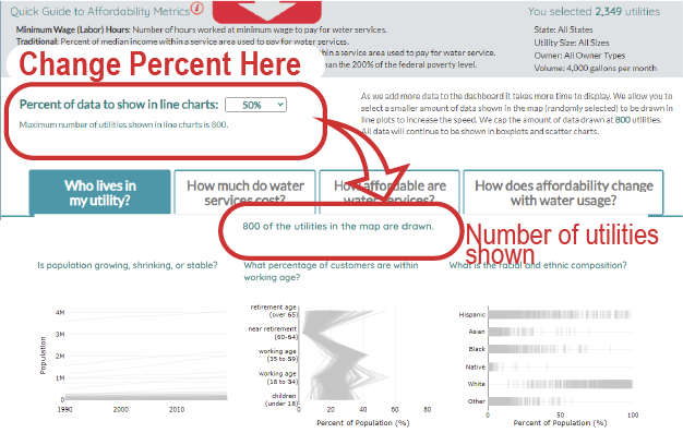
+ How much data to show in line charts?
The place to change the percent of data is located between the map and chart tabs.
+ Who lives in my utility?
This tab provides some basic demographic information about the utility that might be relevant to affordability and equity. Note that very small and small utilities may be much smaller than block groups, creating problems for estimating who lives in the utility. More refined census data or survey methods are needed to have a good sense of who lives in those utilities.
- Population. The estimated population in the service area. We use the Environmental Protection Agency's Safe Drinking Water Information System (EPA SDWIS) data to set the current population. We adjust the estimated population for previous years according to the difference between our estimated population for today and the SDWIS estimate. For example, if we estimated 100 persons today, but SDWIS reports 110 persons (10% higher), then we increase the estimated population in 1990, 2000, and 2010 by 10%. Service areas with a growing population have a growing revenue base, while those with a shrinking population have a shrinking revenue base.
- Working Age. The percent of the population to be in different age groups. We assume those under 18 are not contributing towards paying water bills. We assume those between 18 to 59 are more likely to be employed and paying for water services. We assume those over 65 may be retired and on a fixed income where it becomes harder to pay for services as those costs increase. We assume those nearing retirement are still working, but the utility may be interested in the size of the population nearing retirement (especially if they have Customer Assistance Programs for senior citizens).
- Racial Diversity. The percent of the population identifying with different racial and ethnic groups. The census treats race and ethnicity as separate categories. Racial categories included: Asian, Black, Native, White, and Other (includes those identifying as multiple races, Pacific Islander, or other). Ethnic categories included: Hispanic or Not Hispanic. The racial categories add up to 100% and the ethnic categories add up to 100%. There are many conversations around the inequities of water services an affordability issues that are tied to racial inequities.
Example of charts providing information about the selected utility's population, age, and racial diversity

- Income Diversity. The estimated percent of households based on their income brackets. We added all the households in the block groups for the service area. We divided the number of households in each census bracket by the total number of households. This chart shows the distribution of income in the service area (how diverse are incomes?). The title highlights the percent of households earning less than $75,000 (the middle census bracket).
- Unemployment over time. The average annual unemployment rate for counties that intersect the utility service area. We assume higher unemployment would result in more difficulty for some households to afford water services. It is more likely these customers would benefit from some type of customer assistance program.
- Unemployment and the COVID-19 Pandemic. The COVID-19 Pandemic resulted in an economic slow down. The timing and number of jobs lost and later recovered has varied across the U.S. At a time when the importance of water for public health became critical, many struggled to pay for water services because of job losses.
- Household Age. The estimated percent of houses built each decade. This chart provides an approximation for the age of the pipe infrastructure in the service area. We assume that those service areas with the majority of houses built prior to 1950 might have higher replacement costs as those pipes are at the end of their expected life. Additionally, those with older houses built prior to 1986 when Congress banned the use of lead in pipes may have more lead in their pipes that need replacement. The title provides information about how many households are more than 70 years old (built before 1950) and how many are more than 30 years old (built before 1990).
Example of charts providing information about the selected utility's income, housing age, and unemployment

+ How much do water services cost?
This tab provides some basic information about the monthly bill of the utility selected in the map for a particular volume of water, a table with information about the rates used to estimate the bill, and some charts showing the different components of the bill and how those components compare with their peers.
- Total Monthly Bill shows how much of your monthly bill is spent for drinking water, wastewater, and stormwater each month for the selected volume of water used. The monthly bill is the average of all utilities in the service area (i.e. if there are multiple wastewater or stormwater providers) and all class categories (i.e. if the utility charges different rates based on location - such as elevation zones, neighborhoods, and so on). The exception is for inside and outside classes, in which case we show the estimated monthly bill for those living inside the municipality and those located outside of the municipality but within the service area.

- Find Utility Websites is a table providing information about all utilities within the selected service area that were used to estimate the monthly bill:
- pwsid: is the unique identifier for the drinking water utility and the service area boundaries used here.
- service area: is the name of the drinking water utility and service area.
- city name: some service areas include several cities and towns that may have different wastewater and stormwater providers. When this happens, we include each city/town and list the drinking water, wastewater, and potentially stormwater utility associated with that city/town.
- utility name: the wastewater and stormwater services may be provided by different utilities from the drinking water utility. When that occurs, we list the name of the utility. We list the different utility names associated with each city and town when there are more than one wastewater or stormwater providers in the drinking water service area. We estimate the average bill for each service provided from each unique combination of city name and utility name.
- service type:the type of service provided: drinking water, wastewater, or stormwater. If the wastewater system is thought to be septic, we list the service as septic/on-site.
- year rates started:the year this rate was established. If there was no data on the website, we listed it as current year.
- rates found here: a url link taking you to the website where rates were identified. These links are owned by hundreds of utilities and may no longer be correct.
- data last updated: the year the data were entered. Eventually, we hope to continually update the underlying rates database.
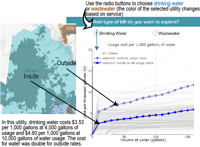
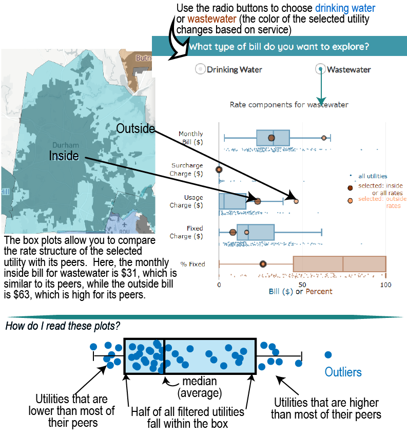
- Explore Rate Structures compares the rate structure (e.g. percent of bill that is fixed, the amount charged per 1,000 gallons of water used) of the selected utility with their peers. Select whether you want to explore drinking water or wastewater rates.
+ How affordable are water services?
We provide the results for five affordability metrics in this tab.
- Income Dedicated to Water Services (IDWS) is the metric that is initially displayed. IDWS shows the prevalence of shared affordability burdens by showing how many households spend a similar percent of their income on water services. For context, each 4.6% of income represents a day of labor each month. The light color lines show all selected peers while the highlighted lines show the IDWS curve for the selected utility. Note, utilities that cover a very small proportion of a block group are not shown here because when weighted less than 1 or 2 households may be present. For example, if a utility covers 0.2% of a block group, we have no way of knowing if the population served by the utility is representative of the remainder of the population in this block group. Additionally, users may click on the checkbox to see a table showing the percent of households in a shared income bracket and the proportion of the income in that bracket that is spent on water services.

- Compare Metrics shows four metrics together. Minimum Wage Hours, Traditional, and Household Burden metrics are shown within the context of how many days of labor are needed to pay for water services (with each day of labor in a month equivalent to 4.6% of income earned).The Poverty Prevalence indicator is shown within the context of low, moderate, or high levels of poverty (defined as the percent of the community below 200% of the Federal Poverty Level)... although remember that these thresholds are somewhat arbitrary and there is little difference between 19% ("low") and 21% ("moderate"). Lastly, remember that Minimum Wage Hours is the only metric truly concerned with the affordability of water services for a specific household (i.e. that of the minimum wage earner). The other three metrics are concerned with the affordability of a representative population in the community (the median and lowest quintile incomes). Metrics are displayed as boxplots to allow users to compare a selected utility with the selected peers.
Household Affordability Metrics

Community Financial Capability Metrics

- Affordability Burden provides an affordability burden level for the utility after combining two metrics: Household Burden and Poverty prevalence per recommendations from a 2019 report by the American Water Works Association, National Association of Clean Water Agencies, and the Water Environment Federation. The colors of utilities and block groups in the map are based on this chart and assign burden levels from low to very high. The farther to the right a utility is located on the chart, the greater the importance of widespread poverty to creating affordability challenges. The higher up in the chart a utility is located, the greater the burden of rates on low-income (20th percentile) households to afford water services. The selected utility will be highlighted in the chart among its peers. The categories from low to very high were created by intersecting the recommended thresholds for poverty prevalence with each day of labor needed to pay for water services in a month. Notice, that the categories do not change once more than 2 days of labor are spent; however, each day is clearly demarcated to show the increasing affordability burden for utilities.
Affordability Burden

Lastly, we provide a chart that only shows how affordability changes for the selected utility from zero to 16,000 gallons. The result is a vertical line since the poverty prevalence is not contingent on water usage. The amount of water used changes the bill, which changes the percent of income spent on water services. Notice that some utilities appear start at 2,000 or 3,000 gallons - this simply reflects that there is no charge for some minimum amount of water used. The length of the lines is sensitive to both (1) rate structure and (2) the incomes of the lowest quintile. For example, with rate structures, the cost will increase much more for a utility charging $10.00 per 1,000 gallons than a utility charging $4.00. For example, with the lowest quintile income, a $100 increase in a bill reflects a 5% increase in the household burden for a household earning $2,000 a month compared with an 8.3% increase in a household earning $1,200 a month.
Change in Household Burden with Water Usage

Burden Table

In addition to the affordability chart, we also provide a table that summarizes the number of utilities in the database and the number of peer utilities based on map selections that fall within each burden level. Additionally, for the selected utility we provide the number of block groups in each burden level. The number of block groups is also reflected in the map when you hover over a utility.
+ How does affordability change with water usage?
This tab summarizes how many utilities share a similar affordability challenge for all volumes of water used (0 to 16,000 gallons a month). The charts only show those utilities selected in the map. The y-axis is the percent of utilities that share a similar burden while the x-axis is the volume of water. Charts are drawn for:
- Burden Level: see the percent of selected utilities that share similar affordability burdens at different volumes of water usage. These percentages reflect the number of utilities in the map showing a particular affordability burden.
- Minimum Wage Hours: see the percent of utilities requiring minimum wage earners to spend less than half a day, 0.5 to 1 day, 1.1 to 2 days, 2.1 to 3 days, or more than 3 days of labor each month to pay for water services depending on the volume of water used. Note, that the minimum wage is reflective of the state minimum wage and does not capture local ordinances requiring higher wages.
- Poverty Prevalence: see the percent of utilities sharing a similar poverty prevalence (defined as the percent of the community below 200% of the Federal Poverty Level). Notice the percents do not change with volume! That is because this metric is not based on water usage of bills, simply the composition of the community.
- Traditional: see the percent of the median household income in a utility going to pay for water services. Utilities are classified by the number of days spent each month paying for water services with 4.6% reflecting 1 day of labor.
- Household Burden: see the percent of the 20th percentile household income in a utility going to pay for water services. Utilities are classified by the number of days spent each month paying for water services with 4.6% reflecting 1 day of labor.
See the change in the percent of utilities requiring similar amounts of time working to pay for water services when using metrics of Minimum Wage Hours, Household Burden, and Traditional metrics.

+ Videos demonstrating how to use the dashboard
General overview on how to navigate through the dashboard
Deep dive on how to use the map
Deep dive on the "Who lives in my utility" tab
Deep dive on the "How much do water services cost" tab
Deep dive on the "How affordable are water services" tab
Deep dive on the "How does affordability change with water usage" tab
+ Many communities experience widespread poverty
The Poverty Prevalence metric indicates that the many communities are experiencing widespread poverty. Over 3-quarters of utilities served communities where more than 20% of the population was below 200% of the federal poverty level. The average utility served a community with a poverty prevalence of 30%. Regardless of water rates or usage, poverty can make affording water services a challenge for households, and simultaneously create financial challenges for a utility: if a large portion of the population served by a utility has low income, then the revenue potential for the utility is constrained.
No utilities with a Poverty Prevalence below 20% were classified with high or very high affordability burdens at all volumes of water use (although minimum wage earners in the community would still struggle to pay high bills).

+ Low minimum wages contribute to affordability challenges
We applied the state minimum wage to utilities in this study, recognizing that local governments may have higher minimum wages that would change our results. North Carolina uses the federal minimum wage of $7.25. At 6,000 gallons per month, minimum wage earners would spend 15 hours (almost two days) each month to pay for water services in the average utility. In contrast, California had a minimum wage of $12 in 2019, with minimum wage earners spending a little over 8 hours (1 day) of labor to pay for water services each month in the average utility. Higher minimum wages would help alleviate household affordability challenges and increase the financial capability of utilities.
For example, let's assume a day of labor is affordable. A minimum wage of $7.25 means water services (drinking, wastewater, and stormwater combined) would have to be less than $58 a month ($7.25 * 8 hours). Now, if the minimum wage was $12 then the combined water services could charge up to $96 a month and be considered affordable. At $15, the combined water services could charge $120 a month, and so on. In short, higher minimum wages benefit households while increasing the financial capability of utilities.

+ Between a tenth to a third of households spend more than a day of labor each month to pay for water services
The Income Dedicated to Water Services (IDWS) metric provides a new way to explore affordability. While the other metrics in this study look at a single population (Minimum Wage Earners) or a representational slice of a community (the median or low-income household), this approach combines both the prevalence of affordability challenges (how many households) with the depth of affordability challenges (what percent of income is spent on water services). This metric allows us to consider what constitutes undue hardship, how many households does this influence, and the volume of water that is considered enough to meet basic needs. All of these are value based decisions that may differ between communities.
For example, in our study exploring
1,800 utilities we looked at 5% of income, or a little more than a day of labor a month, as representative of reasonable hardship. We found that 10% of households spent more than 4% of their income water services when using 2,000 gallons per month (a relatively small amount of water). This number increased to 18% of households by 6,000 gallons per month and 30% of households by 12,000 gallons per month. The percent of households in "undue" hardship changes as the definition of undue hardship changes. At this definition, between a tenth to a third of households spend more than a day of labor (4.6% of income) each month to pay for water services. Is that acceptable? The IDWS allows conversations of undue hardship to take place while understanding how many households may be affected.
Percent of households in the median utility experiencing undue hardship with different percent of incomes used to define undue hardship.
| Volume of Water (gallons) | Undue Hardship: 4% | Undue Hardship: 5% | Undue Hardship 6% |
|---|---|---|---|
| 2,000 gallons | 13% of houses | 10% of houses | 8% of houses |
| 6,000 gallons | 23% of houses | 18% of houses | 14% of houses |
| 12,000 gallons | 34% of houses | 28% of houses | 23% of houses |
+ Days of labor provides good context for understanding the burden on households to pay for water services
Note that the Traditional and Household Burden metrics are not measuring household affordability, but rather are the rates affordable for the median or low-income household in a community.
Recommended thresholds for different affordability metrics can be translated into days of labor
The maximum water bill for recommended thresholds and hypothetical incomes are also shown.

+ Affordability varies across and within utilities
Affordability is more than cost. It combines the cost of services with the income of individuals living in that service area. We looked at all estimated bills costing between $70 to $80 and found when we looked at the affordability burden for a $10 range that:
Due to poverty prevalence alone:
- 18% classified as having a low affordability burden
- 27% classified as having a low-moderate affordability burden
Due to poverty prevalence and household burden:
- 28% classified as having a moderate-high affordability burden
- 25% classified as having a high affordability burden (had to work more than 1 day to pay for services)
- 1% classified as having a very high affordability burden (had to work more than 2 days to pay for services)

Even at nearly the same cost, the ability for households in a community to pay those costs can vary tremendously.
Within a utility, the affordability burden can be similar or change depending on the range of incomes in the community. For example, some utilities have similar incomes throughout while other utilities may have a wide range of incomes. In utilities with a wide range of incomes throughout the service area, some have incomes grouped in certain regions while others have incomes mixed throughout. Since the estimated bill is applied throughout the service area, the differences in affordability reflect differences in incomes.
Examples of how affordability and incomes vary within a single utility's service area

+ Comparing multiple affordability metrics creates new insights into potential drivers and solutions
Several metrics were developed to understand different aspects of water affordability in the U.S. in terms of the financial capability of utilities and household affordability. These metrics are intended to identify what constitutes enough water (volume of water used) and undue hardship to pay for basic water services (learn more). Rather than advocating for one metric, we calculate several metrics across a range of water volumes and provide context for hardship in terms of the number of days of labor needed to pay water bills each month. We found each metric provided different insights, and in combination, can provide a more comprehensive understanding of water affordability challenges for utilities and households.
For example:
- The Poverty Prevalence showed that many of the communities served by utilities are experiencing widespread poverty. More than 75% of utilities served communities where more than 20% of the population was below 200% of the federal poverty level. The average utility served a community with a poverty prevalence of 30%. Regardless of water rates or usage, poverty can make affording water services a challenge for households, and simultaneously create financial capability challenges for a utility: if a large portion of the population served by a utility is low income, then the revenue potential for the utility will be constrained.
- Minimum Wage Hours was not influenced by the community composition but on the cost of water and was greatly influenced by how much water was considered "enough". This metric showed that in a typical utility, minimum wage earners must work 1 to 2 days per month to pay for water services, even when households use relatively low amounts of water (4,000 gallons per month).
+ Many rates are designed to ensure some water is affordable
We found that several of the metrics reliant on water volumes (such as Minimum Wage Hours and Household Burden) increased slowly for the first 2,000 gallons per month. This is likely because many utilities included the first several thousand gallons in the fixed charge. We found that 43% of drinking water rates and 82% of wastewater rates did not have a usage charge at 2,000 gpm. By 4,000 gpm, 92% of drinking water rates, and 43% of wastewater rates had a usage charge, thus increasing sensitivity to the volume of water used. This highlights the importance of rate design on the cost of water services. In the potential solutions section on rate designs we point you to research that looks at the optimal rate design to ensure affordability.
Visit the water services page to learn more about how bills are calculated from rate structures.
Cost per thousand gallons of water added to bill

+ An open, transparent, and repeatable approach allows our understanding of affordability to expand and inform policies and responses
This approach allows our understanding of affordability to expand because we can include more data, update the data, and repeat the metric calculations using the same methods. We also developed an interactive data visualization tool to allow users to explore some demographic characteristics of utilities, some aspects of their rates, and some affordability metrics. The COVID-19 pandemic has reminded us of the immense importance of water for public health and the Biden Administration has recently launched a relief program to improve access to water affordability for low-income households through the Low-Income Household Water Assistance Program (LIHWAP). It is important for us to better understand the scale and dimensions of water affordability challenges to best inform how new policies and programs are implemented.
There are many more questions that can be asked of the data and our hope is that by making the underlying data and code publicly available, many more will do so. You can find the data and code at the water-affordability github repository.
+ We need a unified approach when looking at household affordability across all essential services
Many essential services have recommendations about how much of a household's income should go to various essential services:
- shelter/housing: less than 30% of your income
- energy services: less than 6% of your income
- water services: less than 4.5% of your income
- insurance (car/health): less than 6.5% of your income
- taxes (assuming low income): around 11% of your income
- food: depends on household size, but let's estimate $400 a month ($4,800 annually)
- wifi/internet: lets assume $50 a month for basic speeds ($600 annually)
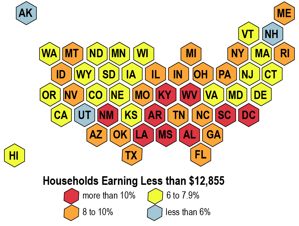
A household would need to make at least $12,855 to break even assuming no assistance. The lowest-quintile income (20th percentile) is higher than $12,855 for all states, ranging from less than $5,000 higher (Mississippi) to more than $22,000 higher (Maryland). However, between 5.5% (New Hampshire) and 13.6% (Mississippi) households are estimated to earn less than $12,855. The problem with individualized thresholds for different essential services is that they are all applied to the same low-income households. In other words, a household struggling to make ends meet for one service is likely struggling to make ends meet in all essential services.
+ Another approach is needed to understand the affordability of very small and small utilities
Our approach is less robust for utilities with a very small service area. Some utilities represent less than 1% of a single block group. Our approach estimates affordability based on the weighted income composition of the block group. For utilities with small service areas the weighted household may be a few houses and it is unknown how accurately the composition of such small utilities represents the composition of the overall block group. As such, for small and very small utilities the results should be viewed with caution. We highlight utilities that may be too geographically small in the dashboard when looking at the IDWS metric results.
+ What states have data in the dashboard?
The dashboard currently contains data about some utilities for several states. These states were included because the state provided drinking water service area boundaries data to the public. There are 10 to 15 states providing public water service area boundaries and utilities in those states will be added to the dashboard as we collect rates data. It is possible to use the municipal boundary as a proxy (as done in Oregon) when utility boundaries are not available; however, the results will be less accurate.
+ Why do we filter the map by state, system size, and owner type?
The filter criteria were based on data obtained from the Environmental Protection Agency’s (EPA) Safe Drinking Water Information System. Note that these characteristics only reflect the drinking water utility and may not be reflective of separate wastewater utilities or stormwater utilities located within the drinking water service area. We used the size of the state, system size, and ownership type because these attributes are commonly thought to influence affordability. By filtering the map, you are able to select peers for comparison.
- State: based on the physical location of the utility
- Size: based on the reported population served. Very small to medium sizes were based on EPA classifications. We created additional categories for medium-large to very large sizes as follows:
- Very Small: 500 persons
- Small: 501 to 3,300 persons
- Medium: 3,301 to 10,000 persons
- Medium-Large: 10,001 to 75,000 persons
- Large: 75,001 to 500,000 persons
- Very Large: > 500,000 persons
- Owner Type: based on who own the utility. The majority are owned by local governments (cities, towns, districts, authorities, etc) or private companies. A few systems were served by a blend of public/private utilities, state government, or the federal government. We combined those into a single category for now. This may change if other states have a greater number of utilities with different ownership.
- Volume: the volume of water used by households in a month. This volume is what determines the estimated household bill. We calculated bills for every 1,000 gallons (134 cubic feet) from 0 to 16,000 gallons (2,139 cubic feet). This range represents the reasonable amount of water that is likely to be considered essential for basic uses.
You may notice some errors in the size or owner classification. Please reach out to EPA to correct the underlying data. You may also reach out to us: water-affordability@duke.edu to temporarily correct errors.
If there are additional filters that may be beneficial, please email and we will try to incorporate those options in future versions of the dashboard. The list of potential data that EPA collects can be found here.
+ Why are data missing for some block groups in the map?
Block groups may not contain residential households, in which case there is no income data. We also flagged those block groups with more than eight persons per household as these often reflect communal living situations, such as universities or prisons. We display the income data when you hover over the block group but did not include those block groups when we calculated affordability metrics. If you zoom into the map you may see a map labeling a university, airport, etc.
+ Why does the hover not appear sometimes? Why does the map shake?
The information box on the bottom left of the map expands when you hover over a utility. If the size of the box covers the location of your mouse, the information box will not appear. Move the map to the right so you can hover over the utilities of interest. Similarly, the map may begin to shake if you are trying to click on a utility behind the information box or the map is only partially on the screen.
+ What devices does the dashboard work on?
The dashboard was designed for use on a desktop. It does not work well for a mobile device. If you must use a mobile device, you will need to use the drop down menu to select a utility. The dashboard has been tested with Chrome, Edge, Firefox, and Safari. It does not work with Internet Explorer.
+ What if I cannot find my utility?
There are few reasons you might not be able to find your utility.
- We do not yet have the data for the utility (either the spatial boundary or the rates). If you have these data and want to include the data in the dashboard, please email with the data and we will add the utility.
- You may have turned on some filters that do not match the criteria of your utility. Turn off all filters to see if your utility is present. There may be a data error in terms of population or owner size. Email and we will update the data. However, it would be best for EPA to update the underlying data.
+ What if the rates for my utility are out of date or have an error?
We manually collected rates and are focused on adding new data to the dashboard rather than updating data. We hope to be able to work with others to develop a process to allow others to share and update the data to make data entry more sustainable. For now, please email to describe the error and/or with a link to where the new rates are located. Thank you for your help!
+ What do the icons above the charts do?
Here is what the icons do in order from left to right.
- [camera]: select this icon to save and download an image of the plot
- [magnifying glass]: select the icon, click and drag over a portion of the chart to zoom in
- [cross arrows]: select the icon, click and drag to move the chart around (pan)
- [+ sign]: select the icon to zoom in
- [- sign]: select the icon to zoom out
- [rotated cross arrows]: select the icon to zoom out
- [house]: select the icon to reset the chart
- [chart icon]: select the icon to go to plotly, which provided the libraries used to create these charts
+ How do I interpret the maps and charts in the dashboard?
Please visit our HOW TO USE THE DASHBOARD tab to learn about the maps and charts. There are YouTube videos available that walk through navigating the different elements of the dashboard.
+ Where can I get the data and learn more?
- The raw data, processed data and code to create the processed data (written in R) are provided in our gitHub repository.
The repository also provides a pdf detailing the work flow from collecting data to calculating metrics to developing a dashboard. - The data and code are licensed under the creative commons clause and we only ask that you use the citation provided in GitHub if you use the data or code in your research or applications as described in the terms of use. This helps us to know whether to continue pursuing long-term maintenance and development of the underlying rates database.
- If you are publishing a paper, we ask that you use the citation to our paper (once accpeted); in the interim, please use the citation to the static data repository used to create the results in our paper:
Patterson, L. & Doyle, M. (2021). Data and scripts from: Exploring the affordability of water services within and across utilities. Duke Research Data Repository. https://doi.org/10.7924/r4862k514 - The paper describing our approach and results.
